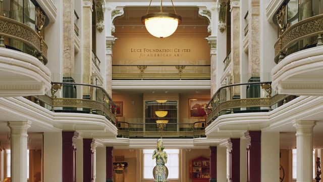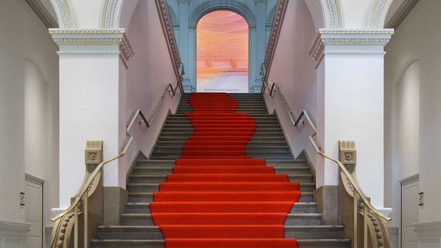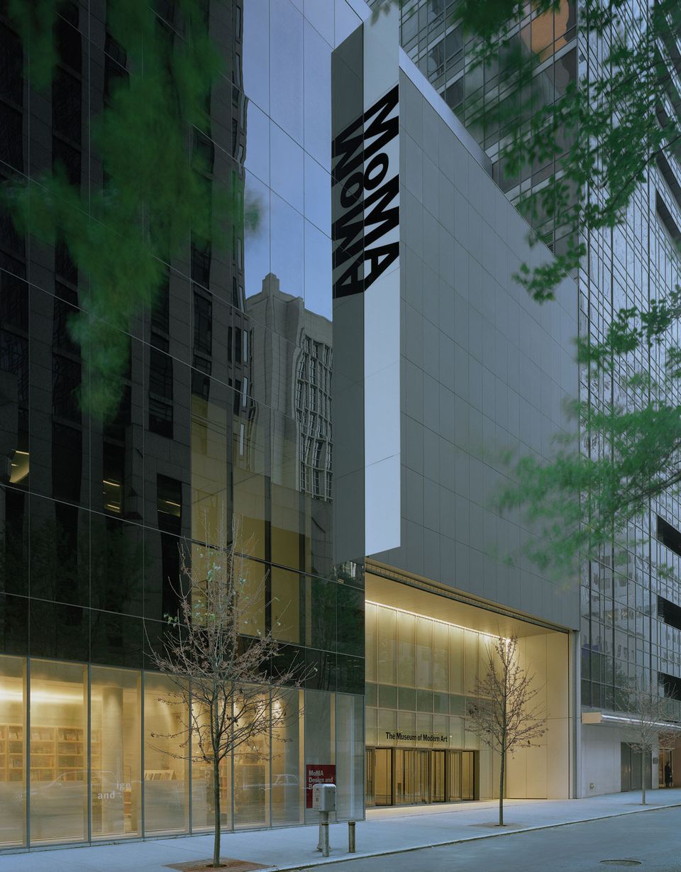
The Museum of Modern Art, designed by Yoshio Taniguchi. Entrance at 53rd Street. © 2005 Timothy Hursley
First in a three-part series about fall lectures in Washington, DC. Glenn Lowry, the director of MoMA, spoke at the Hirshhorn in late October.
Walking in a few minutes after the lecture began, I caught only the tail end of Glenn Lowry's analogy in which he likens the MoMA, and the museum taken generally, to a laboratory. By the time I was seated Lowry had shifted gears, putting up a slide of the notorious art chart by Alfred Barr. For the uninitiated, Barr—the creator and first director of MoMA—wrote the chart for the dust jacket of the catalog for the landmark 1936 exhibition, "Cubism and Abstract Art." It's a diagrammatic map of the causal forces that molded modernism.
I never get tired of looking at the thing. Especially the empty real estate: Can't you nearly make out the "Picasso vs. Matisse" line? Horizontal, two arrowheads, linking "Fauvism" and "Cubism." Or perhaps "Duchamp" as a movement in and of himself? A map that truly charted the course of modernism, allowing for all the back and forth between artists and movements (and literature, and history, etc.) would be Borgesian to say the least. And yet probably still not so complicated as the NYC subway map.
Lowry's lecture centered on this mapping aspect of the museum's mission: an obligation to chart the history of modern and contemporary art and, to a significant degree, plot its future. Now, here I'd like to give you sharp quotes and bulleted items outlining Lowry's approach. But unfortunately for your correspondent—who was taking notes with old media technology—Lowry read a fairly detailed essay in lieu of giving a traditional speech, and read it rather quickly. So forgive me for glossing over the finer points when I say that Lowry reviewed the signature works that represent MoMA's wide-angled approach to the movements and moments in its collection. Some time ago James Panero of the New Criterion aptly described MoMA's approach as benefiting "by staking out only the bare minimums and by interpreting these minimums in the broadest possible terms."
The director also discussed Yoshio Taniguchi's redesign, which just celebrated its first birthday. Continuing on in a way that reinforced the cartography theme, Lowry presented slides of city maps, blueprints, and photographs that illustrated the residential and commercial zone boundaries that MoMA straddles. Lowry argued that Taniguchi's design is truly obedient to the urban landscape. Taniguchi's new façade for 54th Street, to give one example, is understated, in keeping with the residential zoning. Multiple entrances for different quarters of the neighborhood can be read as a promise to provide access to all society.
That brings up the million-dollar question—or the $20 question, as it were—which the Washington Post's Jessica Dawson broached in the Q&A following the speech. Is MoMA's $20 entrance fee prohibitive for some? I would have expected a boilerplate response to this one, given the year of media attention paid to the issue. Nevertheless, he covered all the bases: Unlike many of our fair institutions in Washington, MoMA is not publicly funded, and Manhattan real estate isn't exactly cheap; the Target Corporation picks up the tab on Friday nights; tickets for seniors and students are discounted. And, of course, that everything is expensive in New York.
Exhaustively explored territory though it may be, that debate puts MoMA on a demographic map to go with the historical and geographic maps Lowry reviewed. It's probably better that I didn't hear his opening bit about the laboratory—I'm not sure my metaphor could take the strain.

