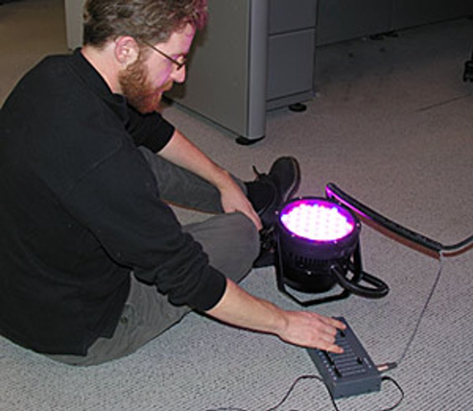
Scott Rosenfeld, our lighting designer, tests a new lighting system.
A small crowd gathered in our offices this morning to watch Scott Rosenfeld, SAAM's lighting designer, play with this funky new light fixture. Instead of a halogen or incandescent bulb, it has an array of colored LED's and a control panel with sliders that manipulate the color balance of the light. It's surprisingly bright, and it reminded many of us of a cross between a (very, very intense) disco light and a Lite-Brite, if you remember those.
Scott is trying to figure out if this fixture has any application for our building reopening—perhaps some subtle exterior lighting? He and his colleagues have four months to install about 6,500 conventional track-mounted fixtures for the art galleries--and countless other fixtures for public spaces, architectural details, the museum shop, and food service areas. Somehow they'll wrestle it all into the perfect, effortless environment we expect in a Smithsonian art museum and a historic building.
There's a lot of hardware and technology that goes into museum lighting. Yet the peculiar thing about Scott's profession is that when he's doing his best work, visitors are not supposed to notice it. In an ideal gallery, the artwork should become part of a balanced atmosphere that puts visitors at ease and heightens their perception—no ugly shadows, no glare, just you and the art.
Maybe this is the central irony of all the design and craft trades that support museum exhibitions. It's easy to spoil an artwork with the wrong frame, bad lighting, a gaudy carpet, a rattling air vent, or a misstep in any of choreographed elements that make a museum a great place to see art. The challenge lies in doing all these tasks so well that the elaborate staging fades into the background.

