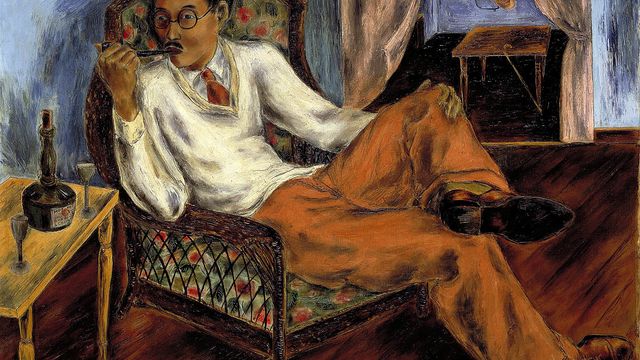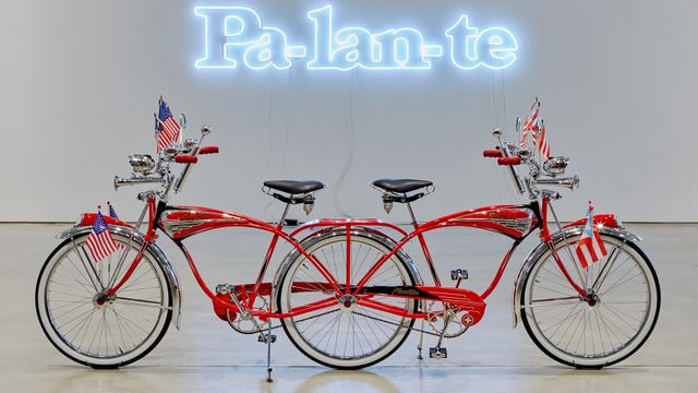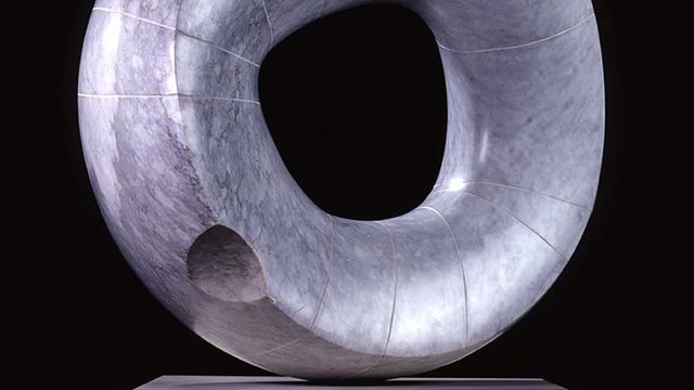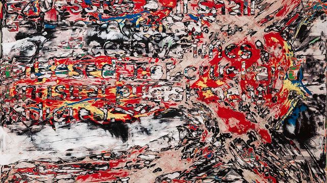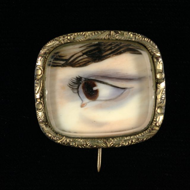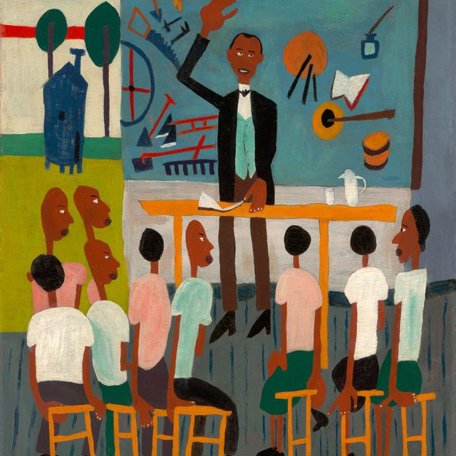
Interior Designers Anna Kahoe and Scott Fazzini are inspired by Dennis Burlingame's Snake Charmer (left) and Joseph Hirsch's The Naked Man (right).
DC has always been more than just the seat of the United States government. It has produced a long list of artistic genres and movements (Washington Color School, go-go, and post-hardcore, just to name a few). And, of course, Washington is home to a large number of art museums and organizations. It also has a thriving arts community. Here at American Art, we have been fortunate to be able to host some of the amazing artists and musicians in various programs throughout the year.
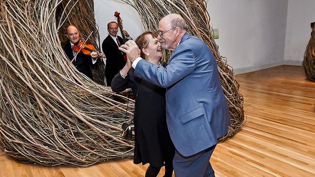
This summer we decided to tap into another group of creative thinkers in the community: designers. We started off our new summer series, Luce Design, with local fashion designer, Jackie Flanagan, on June 20th. Flanagan spoke to visitors about her clothing line, Nana, her desire to create ethically-made products, and her support of other local designers. Visitors were also able to get a sneak peak of some of her fabrics for her fall line. After the talk, Flanagan opened up the discussion and visitors asked her about her inspiration, her favorite fabric store in New York City, and the potential for a children's line. I particularly loved when Flanagan excitedly told visitors the swell of pride she feels every time she sees someone wearing her design.
Next up with our series are local interior designers Anna Kahoe and Scott Fazzini on Wednesday, July 11, at 5:30 p.m. Kahoe and Fazzini are going to help participants design their own room around a piece in the museum's collection. They will talk about where to find inspiration and how to pull together a room, or a "room with a view" as they described it. We asked Kahoe and Fazzini a few questions about the program and some insider tips for those of us still starting off.
Eye Level: If you could design a room around one artwork on view in the Luce Foundation Center, what would it be and why?
Anna Kahoe: Dennis Burlingame's Snake Charmer. Why? It has a lot of my favorite design elements. I came to interiors via my love of old things and this piece evokes what I refer to as Faded Grandeur. Also it's a great combination of seedy, beautiful, sexy and whimsy, just like the circus. I also love the curves and repeated and varied patterns. Plus, right now I have a major thing for green walls.
Scott Fazzini: If I could design a room around a piece of work at the Luce Center it would be The Naked Man by Joseph Hirsch. I was initially attracted to the stark contradiction of light and darkness, the layering of blues and greens, and the repetition in the mounds of clothing in the young man's hands and the stack of drawers to his right. After having read a bit about the painting, I find not just the topical aesthetic to be inspiring, but the story of a young man standing at a precipice of life to be equally beguiling.
EL: During tomorrow's program you are going to help museum visitors create their own mood board. What is a mood board and what would yours include for the American Art artwork you picked?
AK: A mood board is a place to organize your creativity. Some people may use it as place to contain specific ideas about a room or a project and some may use it just to keep track of shapes colors objects that reflect back to them the feeling of what they hope to create. [Mine would include] Fabric samples, paint swatches,wallpaper swatches, photos of furnishings.
SF: A mood board helps to corral ideas, and serves as a sounding board on which to begin the design process. When I create a mood board it generally contains design elements such as furniture, rugs, lighting, as well as inspirational images which include anything from artwork, to clothing.
EL: More and more young people are moving into the city. What decorating advice would you give these people, or anyone else on a budget and moving into their first apartment?
AK: My advice to young people on a budget is don't try to copy someone else's look. You are young and you will get at least several shots creating your space. Experiment! Figure out what you like and you can never have too many mirrors or lamps.
SF: I learned a lesson very early in my career which was to "buy well rather than often". This is a mantra which has always stuck with me. My advice to anyone interested in designing their space is to only bring things into it which they truly are drawn to. Never bring objects into your home as a "place holder". It's much better to have fewer things that you love than many things that you feel lukewarm about.
EL: What other designers and/or artists inspire you and why?
AK: I am of course inspired working with Scottie everyday. He creates order out of chaos he is refined and tailored but never boring there is always an element of magic in his work. I love Kelly Wearstler's references to the 70s and her nods to old Hollywood. I love David Hicks' bold geometrics and Tony Duquette's magical exaggerations of the natural world. I am also inspired by all things bohemian a free spirit sense of things collected from travels and experience relaxed but rich decadent but not precious touchable and luscious.
SF: I'm continually inspired by people: great designers, strangers on the street, and loved ones. I admire the aesthetic restraint of the master architects at the firm of McKim, Mead, and White, am enamored by interior designer Miles Redd's modern take on classic design, and am jealous of the free-spirited creative thinking shown to me by Anna Kahoe.
Come make a mood board with us tomorrow evening at 5:30! If you are unable to make it, but want to learn some design tips from an expert, the next (and last) Luce Design is at 5:30 p.m. on Wednesday, August 15, with landscape architect Thomas Kapfer.


