Getting to know some of our visitors was the inspiration for a new blog series, Visitor's Choice. In this series, we ask our regulars about their favorite artworks and why they like them. Since everyone has a unique relationship with art, some of the posts will be more in-depth than others, some might reflect the artist's intent, and some might have more of a personal meaning.
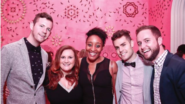
In the third installment of our Visitor's Choice series, we spoke with local, self-described "designer artist" Tara NaTasha. Tara has been a regular fixture at our Luce Foundation Center programs for a couple of years now, especially our art making activities. We always enjoy seeing her here and enjoy the creative results she comes up with!
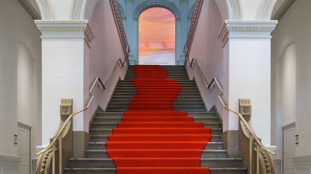
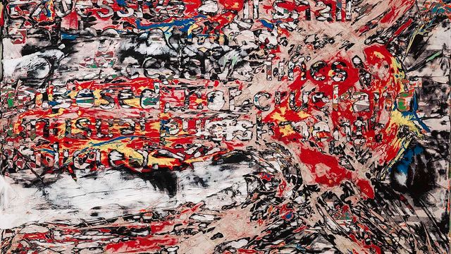
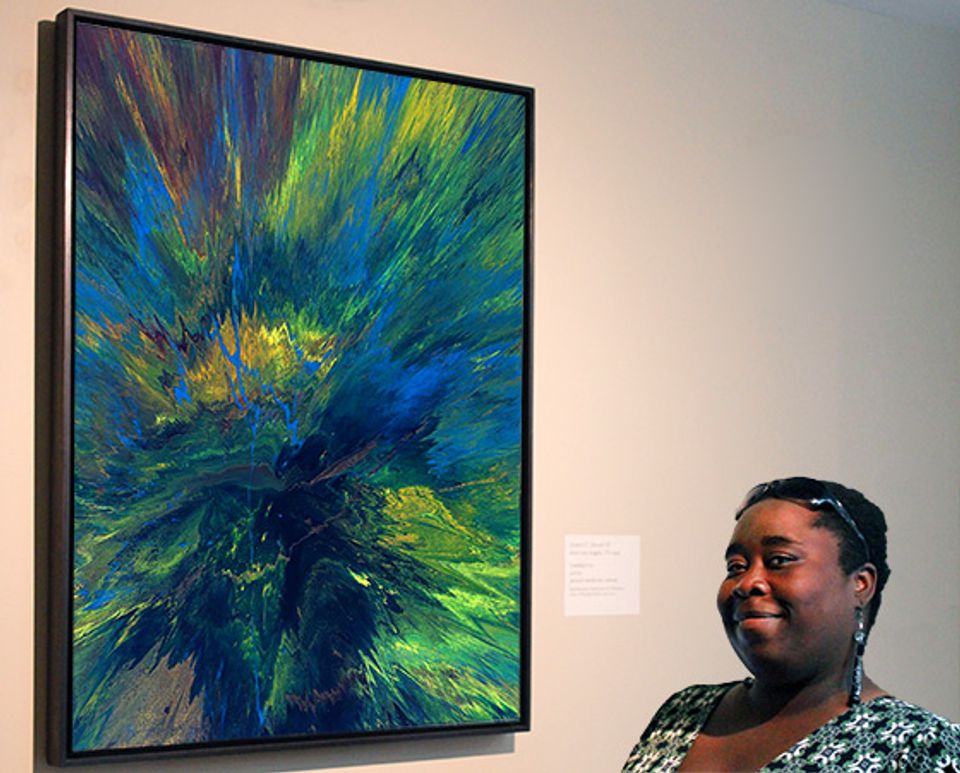
Tara is an extremely creative individual and loves to share her passion for art with everyone around her. When I spoke with Tara about her favorite piece here at American Art, she shared this insightful interpretation of James F. Dicke II's Untitled #21:
I love what this piece accomplishes by just using color. It's easy to be transported to a place when the subject is a place or something that you can (or want to) relate to, but what happens when the subject, is essentially, nothing?
When a work inspires your imagination to create a special and unique place within its context and using its composition, it becomes great. The only thing better than a work that's not the same thing twice, is a work that guarantees that you'll enjoy that many variations that it may come in over the years.
Jim Dicke's paintings certainly invite this kind of close looking and personal reflection. As an artist, he believes that ambiguity and beauty should address the senses and strives to create pieces that will make the viewer want to take another look.
Do you have a favorite piece in our collection? If you do, stop by the Luce Center information desk. We'd love to hear about it and maybe you'll see yourself on here on Eye Level!

